1.858.217.5144
Start your project

The Psychology of Color Use in PowerPoint Presentation
Color Contrast
color wheel
Custom Designed Presentations
investor presentation
Pink Despite
PowerPoint Agency
PowerPoint Design
PowerPoint design experts
PowerPoint specialist
presentation
Presentation Agency
Presentation Company
Presentation Consultation
Presentation Designers
Presentation Firm
professional presentation
Jul 15, 2013
Colors are a powerful tool in presentation design, influencing how your audience perceives your message and feels about your content. Different colors evoke different emotions and reactions, making color selection a critical part of your PowerPoint design strategy. Understanding the psychology of color can help you choose the right palette to engage, persuade, and connect with your audience.
Here’s a guide to the psychology of color use in PowerPoint presentations:
1. Red: Attention-Grabbing and Energetic
Red is a high-energy color that immediately draws attention. It’s often associated with excitement, passion, and urgency. However, too much red can feel aggressive, so use it sparingly.
How It Affects Your Audience :
- Creates a Sense of Urgency : Red is commonly used to highlight important information, calls to action, or warnings.
- Increases Energy : Red can stimulate feelings of excitement and intensity, making it ideal for emphasizing key points.
How to Use It :
- Use red to highlight important numbers, urgent messages, or key calls to action.
- Avoid using red for large blocks of text, as it can be overwhelming.
2. Blue: Trustworthy and Calming
Blue is associated with trust, professionalism, and calmness. It’s a popular color in corporate presentations because it conveys stability and reliability.
- Builds Trust : Blue is often used in corporate settings because it fosters a sense of security and trust.
- Calming Effect : Lighter shades of blue can have a soothing, calming effect on your audience.
- Use blue for backgrounds, headers, or in charts and graphs to convey professionalism.
- Combine blue with contrasting colors like orange or yellow for a balanced design.
3. Green: Growth and Balance
Green is the color of nature and is often associated with growth, harmony, and health. It’s commonly used in presentations related to sustainability, finance, or wellness.
- Represents Growth : Green is perfect for presentations that focus on growth, whether it’s financial, personal, or environmental.
- Promotes Balance : Green has a balancing effect, creating a sense of calm and stability.
- Use green for financial presentations or topics related to sustainability and the environment.
- Combine green with neutral tones like gray or white for a clean, fresh look.
4. Yellow: Optimism and Attention
Yellow is a bright, cheerful color that evokes feelings of optimism and happiness. It’s an attention-grabber, but it should be used in moderation to avoid overwhelming your audience.
- Inspires Optimism : Yellow can uplift your audience and create a sense of positivity.
- Draws Attention : Like red, yellow is great for emphasizing important information, but it’s less aggressive.
- Use yellow to highlight key points or to add a sense of warmth and optimism to your presentation.
- Avoid using yellow on white backgrounds, as it can be hard to read.
5. Orange: Creativity and Enthusiasm
Orange is a vibrant, creative color that combines the energy of red with the warmth of yellow. It’s often associated with enthusiasm, creativity, and confidence.
- Stimulates Creativity : Orange can inspire creativity and out-of-the-box thinking, making it ideal for creative industries or brainstorming sessions.
- Conveys Enthusiasm : Orange is a warm and energetic color that can make your presentation feel more exciting and engaging.
- Use orange for creative presentations or when you want to convey a sense of enthusiasm and innovation.
- Combine orange with neutral tones like gray or blue to balance its vibrancy.
6. Black: Power and Sophistication
Black is a bold, powerful color that conveys elegance and sophistication. It’s often used in formal presentations or to make a dramatic statement.
- Conveys Authority : Black is a strong, authoritative color that can add weight to your message.
- Creates Sophistication : Black is often associated with luxury and exclusivity, making it perfect for high-end presentations.
- Use black for backgrounds or as an accent color to create a sleek, professional look.
- Be cautious with too much black, as it can feel heavy or oppressive.
7. White: Simplicity and Clarity
White is the color of simplicity and clarity. It creates a clean, modern look and is often used as a background color to provide contrast with other elements.
- Represents Clarity : White gives your presentation a sense of openness and space, making it feel clean and uncluttered.
- Provides Contrast : White backgrounds create a stark contrast with darker colors, making text and images stand out.
- Use white as a background to create a minimalist, modern look.
- Combine white with bold accent colors to draw attention to key points.
8. Gray: Neutral and Balanced
Gray is a neutral color that represents balance, calmness, and professionalism. It’s often used as a background or accent color in more conservative presentations.
- Creates Neutrality : Gray is non-intrusive and creates a neutral backdrop that doesn’t distract from your content.
- Adds Sophistication : Darker grays can add a level of sophistication and professionalism to your slides.
- Use gray as a background or accent color in more formal or corporate presentations.
- Combine gray with brighter colors like blue or yellow to add contrast.
Final Thoughts
The psychology of color plays a crucial role in how your audience perceives your PowerPoint presentation. By understanding the emotions and responses associated with different colors, you can choose the right palette to enhance your message and engage your audience. Whether you want to inspire trust with blue, create excitement with red, or convey professionalism with black, using color strategically can make your presentation more effective and memorable.
Other popular articles
Designing an investor-ready ‘use of funds’ slide for ai startups.
October 26, 2024
Do Non-Technical Audiences Benefit from Visual Presentations?
October 25, 2024
Expertise on Display: ‘Who We Are’ Slide for Fintech
October 24, 2024
Save Time by Outsourcing Conference Presentations
October 23, 2024
Visualize a Product Launch ‘Timeline’ Slide for Clear Project Phases
October 22, 2024
Mistakes to Avoid on a ‘Patent’ Slide in Consumer Electronics Pitch Deck
October 21, 2024
24×7 Design Services
The Psychology of Color
Sep 01, 2023
0 likes | 26 Views
Share Presentation

Presentation Transcript
The Psychology of Color: How Colors Influence Emotions and Behaviors Colors have an incredible power to affect our emotions, perceptions, and even our behaviors. From the calming blue of the sky to the energizing red of a ripe apple, different colors have distinct psychological effects on our minds. This phenomenon, known as the psychology of color, plays a significant role in various aspects of our lives, from design and marketing to everyday decision-making. Let’s dive into the world of color psychology and explore how different hues can influence our emotions and behaviors. Understanding Color Psychology Color psychology is the study of how colors impact human behavior, emotions, and perceptions. While individual responses to colors can vary based on personal experiences and cultural backgrounds, certain general associations with colors are widely recognized. Red: Energizing and Passionate Red is a color that demands attention. It’s often associated with strong emotions like passion, love, and even anger. This vibrant hue has been shown to increase heart rate and stimulate adrenaline, making it an attention- grabbing choice. In marketing, red is often used to convey excitement and urgency, making it a popular color for sales and clearance signs. Blue: Calming and Trustworthy
Blue is often seen as a serene and calming color, reminiscent of the sky and ocean. It’s associated with feelings of tranquility, trust, and reliability. Many corporations and brands choose blue for their logos and branding to convey a sense of professionalism and stability. Yellow: Energetic and Optimistic Yellow is a color that radiates positivity and energy. It’s often linked to feelings of happiness, warmth, and optimism. Restaurants and fast-food chains often use yellow to stimulate appetite and create a lively atmosphere. Green: Refreshing and Harmonious Green is strongly associated with nature and growth. It’s a color that evokes feelings of balance, harmony, and renewal. As a result, it’s commonly used to promote health, relaxation, and environmental awareness. Purple: Creative and Luxurious Purple has long been associated with royalty, luxury, and creativity. It’s a color that sparks imagination and is often used in branding for products and services that want to convey a sense of uniqueness and sophistication. Orange: Energetic and Playful Orange combines the energy of red with the warmth of yellow, creating a color that’s vibrant and cheerful. It’s often used to promote a sense of fun, enthusiasm, and excitement. Pink: Gentle and Feminine Pink is often associated with softness, romance, and femininity. It’s a color that can evoke feelings of compassion and tenderness. Black: Powerful and Elegant Black is a color that exudes power, elegance, and sophistication. It’s often used to create a sense of luxury and exclusivity in branding and design. White: Pure and Clean White is a color that symbolizes purity, cleanliness, and simplicity. It’s often used in healthcare and wellness- related industries to convey a sense of cleanliness and safety. How Color Influences Behavior Understanding the psychology of color can have practical applications in various fields: Marketing and Branding: Businesses use color psychology to create branding that resonates with their target audience. The choice of colors in logos, websites, and advertisements can influence consumers’ perceptions of a brand’s personality and values.
Interior Design: The colors used in interior spaces can affect mood and ambiance. Warm colors like red and orange can make a room feel cozy and inviting, while cool colors like blue and green create a more tranquil atmosphere. Product Packaging: The colors chosen for product packaging can impact consumers’ purchasing decisions. Vibrant and attention-grabbing colors might encourage impulse buying, while softer colors can convey a sense of sophistication. Healthcare and Wellness: Colors used in healthcare settings can influence patients’ comfort levels. Calming colors like blues and greens are often used in hospitals to create a sense of tranquility. The Role of Color in Management and Academia If you’re studying fields like Construction Management, Customer Relationship Management, or Healthcare Management, understanding color psychology can have implications for your assignments and future career. For instance, when designing customer-oriented spaces in construction or considering patient comfort in healthcare facilities, color choices play a crucial role. For those seeking assistance with assignments in these management fields, services like Construction Management Assignment Help, Customer Relationship Management Assignment Help, and Healthcare Management Assignment Help can provide valuable support. These services offer expert guidance to ensure that your assignments reflect a deep understanding of industry-specific factors, including the psychology of color. Conclusion The psychology of color is a fascinating field that underscores the intricate ways in which our surroundings influence our emotions and behaviors. Whether you’re designing a logo, painting a room, or crafting a marketing campaign, the colors you choose can have a profound impact on how people perceive and interact with your work. By understanding the psychological associations of different colors, you can harness their power to create experiences that resonate deeply with your audience, ultimately enhancing your ability to connect, communicate, and create.
- More by User

The Psychology of Color Which Color, graphics and font for what sites and why? By Teann Nghiem Topics Why do we need to study colors? What are some color terminology? Psychological effects of color What does each color represent? Different cultural interpretations of color
934 views • 22 slides
COLOR WHEEL: The Law of Color
COLOR WHEEL: The Law of Color. Primary Colors The primary colors are Blue, Red & Yellow. They form the foundation for all color. All colors are a combination of Blue, Red & Yellow except for Black & White. Secondary Colors
1.62k views • 52 slides
Psychology of Color
Psychology of Color. Valerie DeMartino INBS 510 November 4, 2002. Psychology of Color. Importance of Color on the Internet What is color? How does color effect emotion? Color Preference Color Snafu’s Color – On the Computer & Internet Standardizing of Color Use of Fonts
822 views • 25 slides

Color Psychology and Informational Color
Color Psychology and Informational Color. Luscher Color Test.
722 views • 37 slides

Color Psychology and Informational Color. How would you feel if you spent time in this room?. What kinds of associations do you have with the décor and colors of this room?. Color Preferences: Colors individuals gravitate towards.
763 views • 53 slides
Color In Design/ Intro to color Psychology
Color In Design/ Intro to color Psychology. Color Preferences: Colors individuals gravitate towards. Based on personality, color bias, color associations, environment, culture, etc. Color Preference. Colors individuals tend to gravitate towards.
1.07k views • 42 slides
Color Psychology
Color Psychology. Color Preference. Colors individuals tend to gravitate towards. Factors influencing color preference:. Learned color bias Variations in the saturation or value of the color Interactions between studied color and the light source or surrounding color
874 views • 37 slides
Color Symbolism & Psychology
Color Symbolism & Psychology. People’s feelings towards colors. Symbolism. Colors often symbolize certain things to cultures. Red, White & Blue? Red & Green? Orange & Black? Red? White? Black?. Use of Color in Interior Decorating.
287 views • 5 slides

Use of Color Incorporating Human Psychology in the Built Environment
Use of Color Incorporating Human Psychology in the Built Environment. Banu Manav University of Bahçeşehir, Faculty of Architecture. Color studies on……. Psychology Physiology Culture Age Gender Urban-regional palette. C O L O R. Aim of the study.
267 views • 11 slides
Psychology of Color. Black. power, sexuality sophistication formality elegance wealth mystery fear Evil Style Sadness good technical color Mourning death. White. reverence, purity, simplicity, cleanliness, peace, innocence, youth, birth, winter, snow,
320 views • 9 slides
Psychology of Color. By Cindell. RED. Red is an incredibly intense color, it stimulates the heart and breathing to increase pace Red cars are popular targets of thieves Red can cause you to feel hunger. Orange. Orange can make you feel enthusiastic It can increase your appetite
277 views • 12 slides
How Color Psychology Influences Consumer Behaviou
Use color psychology to your advantage Do you know that more than 90% of the purchases are influenced by the visual factors? Do you know that 75% of the pencils sold in United States are of color yellow? Do you know that 66% of the people won’t buy appliances if they are not of their preferred color? Color increases your brand recognition by 80% Think Coca Cola! How should you use color in your marketing?
165 views • 9 slides

Color psychology
Color psychology is the study of human behavior. Colors can also enhance the effectiveness of placebos. For example, red or orange pills are generally used as stimulants. http://www.vilasagroup.com/2-bhk-jaipur/
206 views • 9 slides

Online Marketing 101: How Psychology of Color Affects Branding
Color psychology is a fascinating facet of our behavior. In our effort to further understand and build on its importance of promoting brands online, we will discuss variously published researches on persuasion and color theory along with the foundations laid by Gregory Ciotti --Source: https://www.myoptimind.com/
711 views • 28 slides

Color Black: Color Psychology and Personality Meaning
https://want.black/ Are you a black color lover? Then this infographic is for you. Learn more about the meaning and psychology of the color black.
33 views • 1 slides
Psychology of Color for Increase Website Conversions
The impact colors have on our behaviors, actions, and decisions are far greater than we think. So, what is the psychology of color? What does each color actually stand for? All of us tend to identify with color due to a particular feeling or a concept.
149 views • 13 slides
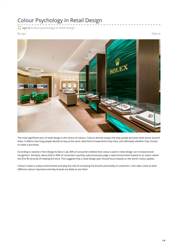
The psychology of color at retail | Retail Customer Experience | AGX
The most significant part of retail design is the choice of colours. Colours directly impact the way people perceive retail stores around them. It affects how long people decide to stay at the store, what kind of experience they have, and ultimately whether they choose to make a purchase. Learn More : https://www.agx.in/colour-psychology-in-retail-design/
81 views • 4 slides
The Psychology of Color. The How and Why of Color. Color Attributes. There are literally millions of colors, but they can be divided into just a few color families. And every color can be described in terms of having three main attributes: hue , saturation and brightness. Hue.
519 views • 43 slides
THE PSYCHOLOGY OF
THE PSYCHOLOGY OF. LEARNING. Permanent Behavior Change based on Practice and Experience. Classical Conditioning. Unconditioned Response Conditioned Response Unconditioned Stimulus Conditioned Stimulus Superstitions. Association of Stimulus and Response Pavlov.
176 views • 11 slides
Color psychology in marketing and branding
First Page Digital Solutions will focus on your business to stand out from the competition. The key to success is exploring the market, the competition and the designer having a good understanding of the company to create a visually appealing brand.
88 views • 2 slides
"Color psychology meaning and interesting facts."
Colors play a very significant role in people's lives. Colors make it possible to see the world differently. However, it is essential to know color psychology meaning and exciting facts that will blow everyone's minds. Read more @ https://bit.ly/3fGznfP
49 views • 3 slides
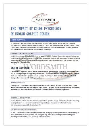
THE IMPACT OF COLOR PSYCHOLOGY IN INDIAN GRAPHIC DESIGN
In the vibrant world of Indian graphic design, colors play a pivotal role in shaping the visual language. As a leading graphic design agency in India, we understand the profound impact color psychology has on conveying emotions, cultural values, and brand messages. Let's explore how this powerful tool influences the Indian design landscape.
30 views • 2 slides
- Scroll to top

- Creative Production
- Design Experience
- Performance Marketing
- Digital Development
- Digital Communication
- B2B Agile Marketing
- Programmatic-Ads(leAD)
- Using Color Psychology to Create Impactful PowerPoint Presentations

- Author Apoorva Chhabra
- Published April 10, 2023
Home Blog Using Color Psychology to Create Impactful PowerPoint Presentations
- Presentation Design
Looking to create a PowerPoint presentation that will really pop?
Forget about fancy fonts and snazzy animations – the key to making an impact is all about color. That’s right, folks, we’re talking about Color Psychology !
Now, we know what you’re thinking: “Color Psychology? That sounds like a load of superficial hogwash!” But hear us out – this stuff is legit.
Think about it – have you ever felt more relaxed in a blue room or more energized in a bright yellow space? That’s the power of color. And when it comes to PowerPoint presentations, using the right colors can mean the difference between a snooze-fest and a standing ovation.
So, grab your color wheel and get ready to learn how to create a presentation that will leave your audience seeing rainbows (figuratively speaking, of course).
But before we dive into the nitty-gritty of color psychology, let’s address the elephant in the room: No, you can’t just make everything neon green and call it a day. Sorry, Kermit. So, put on your serious face and get ready to learn some strategies for using color to make your PowerPoint presentations pop with the pieces of advice from the designers of the best presentation design agency in India.
Alright, Let’s Get Into It!
Color psychology is the study of how different colors can affect our emotions and behaviors. It’s a fascinating field used in marketing, advertising, and interior design for years. But it’s also incredibly useful for creating impactful PowerPoint presentations.
So, how do you use color psychology to create a presentation that will leave a lasting impression? First, you need to understand different emotions and moods associated with different colors. Here are some examples:
- Blue : calming, trustworthy, and professional
- Red : energetic, passionate, and attention-grabbing
- Green : refreshing, natural, and peaceful
- Yellow : happy, optimistic, and playful
- Purple : luxurious, creative, and mysterious
- Orange : friendly, enthusiastic, and confident
Of course, these are just general associations – different cultures and individuals may have different emotional responses to colors. But as a starting point, it’s helpful to keep these general associations in mind when choosing colors for your presentation, as any professional presentation design agency would recommend.
Once you’ve chosen your colors, it’s essential to use them strategically.

Here Are Some Tips For Using Color Psychology In Your Powerpoint Presentation:
- Use Contrast To Create Emphasis
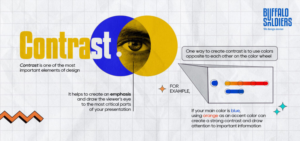
Contrast is one of the most important elements of design. It helps to create emphasis and draw the viewer’s eye to the most critical parts of your presentation. One way to create contrast is to use colors opposite each other on the color wheel.
For example, if your main color is blue, using orange as an accent color can create a strong contrast and draw attention to important information.
- Use Color To Highlight Key Points
Another way to use color strategically is to highlight key points or information.
For example, if you’re presenting data, you could use a bright color like red or yellow to highlight the most prominent numbers or statistics.
- Use Color To Create A Mood Or Tone
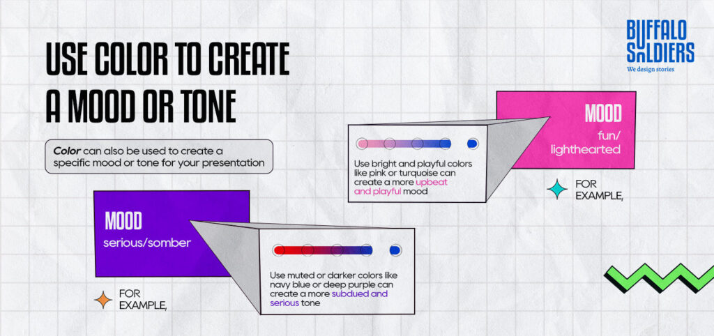
Color can also be used to create a specific mood or tone for your presentation.
For example, if you’re presenting on a serious or somber topic, using muted or darker colors like navy blue or deep purple can create a more subdued and serious tone. On the other hand, if you’re presenting on a fun or lighthearted topic, using bright and playful colors like pink or turquoise can create a more upbeat and playful mood.
- Use Color Consistently Throughout Your Presentation
Consistency is key while creating a polished and professional-looking PowerPoint presentation. Make sure to use your chosen colors consistently throughout your presentation, including on slides, graphs, charts, and images. It will help to create a cohesive look and feel for your presentation.
- Don’t Be Afraid To Mix And Match Colors
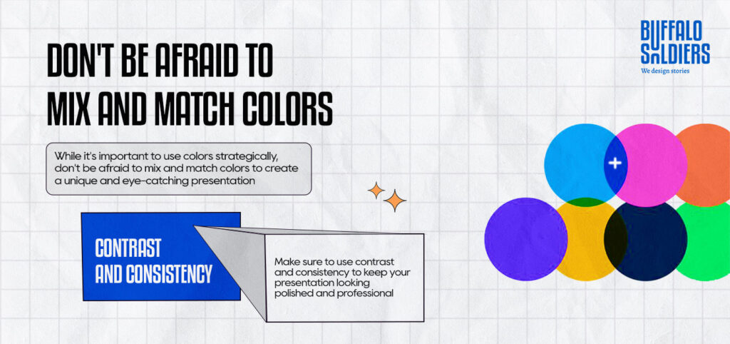
While it’s important to use colors strategically, don’t be afraid to mix and match colors to create a unique and eye-catching presentation. Just make sure to use contrast and consistency to keep your presentation looking polished and professional.
- Use White Space To Balance Out Your Colors
Finally, remember that white space is your friend. Using too many colors can make your presentation look cluttered and overwhelming. Make sure to balance out your colors with plenty of white space to create a clean and streamlined look.
And Therefore…
Are you tired of giving lackluster presentations? Do you want to make a lasting impact on your audience? Look no further than Buffalo Soldiers, a premier presentation design agency in India .
Our expert designers and storytellers work tirelessly to create visually stunning and engaging presentation design services that captivate your audience. With our innovative approach and attention to detail, we will help you deliver your message with impact, leaving a lasting impression on your audience.
Don’t miss out on the opportunity to WOW your audience. Take the first step towards presentation excellence. Act now before your competition beats you to the punch, and leaves you in the dust.
#ProTip: Don’t settle for mediocre presentations – hire Buffalo Soldiers’ PowerPoint presentation design services, and let us take your presentations to the next level. Our unmatched creativity and expertise will help you stand out from the competition and make a lasting impression.

Apoorva Chhabra

Privacy Overview

Your submission has been received. We will be in touch and contact you soon!
Which services are you interested in? (Please select all that apply)*
Digital Marketing Branding & Social Media Management Search Engine Optimization Website Design & Development Video Production Other Marketing Assets
Budget (USD)* 2000 - 5000 5000 - 10000 10000 - 25000 25000 - 50000 50000+

IMAGES
VIDEO